| ISOTOPE 221 | ||||||||
Case Study: Harmony Pharmacy & Health Center |
||||||||
|
||||||||
As a startup with a relatively limited budget, Harmony Pharmacy's CEO had the goal of opening a chain of upscale pharmacies and health centers located primarily in major airports across the country. A first-of-its-kind company such as this needed to quickly establish their brand and their ‘look’ to the public, presenting their international products, top-notch healthcare and tasteful store environment.
We were asked to take a logomark and develop Harmony's entire visual branding, from giftcards to shopping bags, from store signage to their website. Each element retains a flexible but consistent identity: one that combines traditional quality with a modern retail experience.
|
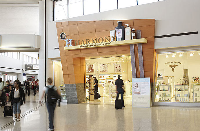
Profitable from the start, the company opened its first location in Newark's Liberty International Airport in 2007 to rave reviews from both air travellers and the media alike. They subsequently opened stores in Greenwich, Connecticut and JetBlue's newest terminal at JFK International Airport with more locations scheduled to open throughout 2009 in Cleveland, San Francisco, Washington D.C., and Dallas/Fort Worth. Additionally,the company has been nominated and won several airport industry awards for best new retail concept and best retail store design.
Created for Eric Baker Design Associates.
|
|||||||
|
|
|||||||
Exterior store signage at Newark International Airport location |
||||||||
|
||||||||
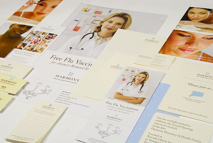
Various posters, stationery, announcements and ephemera |
||||||||
 |
||||||||
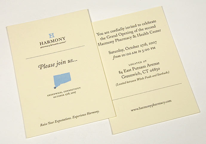
Letterpressed invitations to the grand opening of the first Harmony Pharmacy location |
||||||||
 |
||||||||
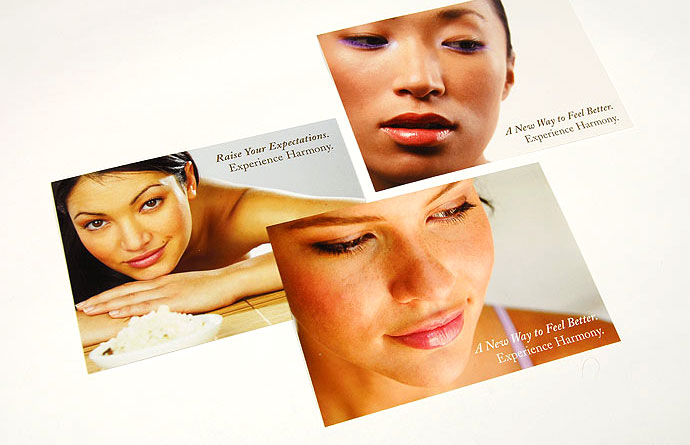
Point-of-purchase postcards |
||||||||
 |
||||||||
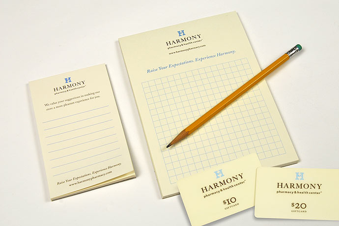
Suggestion cards, pharmacist notepad, and retail giftcards |
||||||||
 |
||||||||
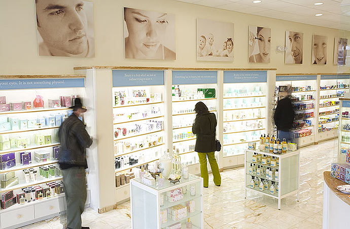
Health & beauty quotation signage and mood photos |
||||||||
 |
||||||||
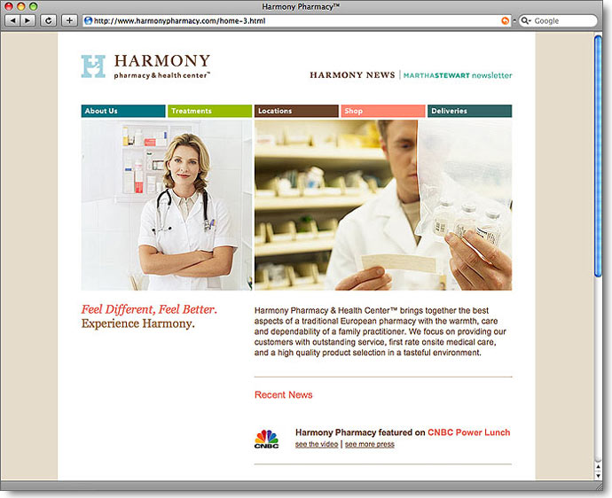
Website homepage |
||||||||
|
718.783.3092 / info@isotope221.com |